

So Topical founders came to my studio with the vision of creating a beauty brand that felt like affordable luxury: modern, ingredient-led, and effortlessly cool.

My role was to develop a complete brand identity that could position the brand within the skincare market while creating a memorable and cohesive experience.
The identity was built around the idea of balancing science with softness. I created a primary logo that allows the brand to adapt seamlessly across packaging, digital platforms and printed materials.
The typography, colour palette, and visual language were carefully selected to communicate trust, elegance, and simplicity while remaining approachable.

Beyond the branding, I designed the packaging system for So Topical. From structural packaging to labels and finishes, crafted to reflect the brand´s elevated yet minimal aesthetic.

The tactile finishes and colour palette reinforce the sensory experience of the products themselves.

Icon design.

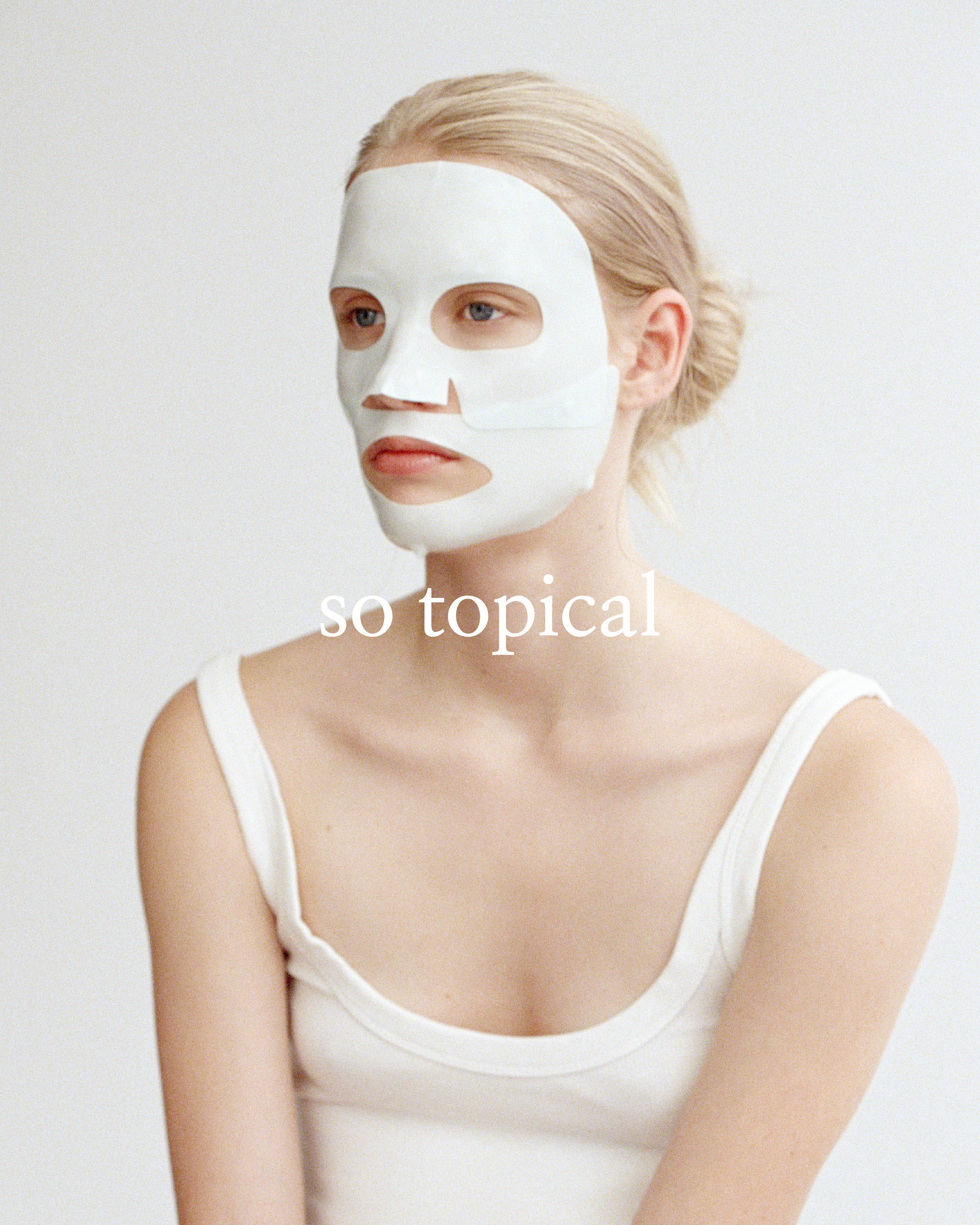
Developing the visual direction for So Topical´s launch campaign was also a part of the project, creating a comprehensive framework for photography, styling, social media and content production.
The campaign embraced natural light, visible skin, and understated beauty to create imagery that feels editorial, authentic and emotionally engaging.

The creative direction extended beyond a single photoshoot, providing guidelines for the brand´s ongoing content strategy.

Secondary logo design.

This project is a reflection of the way my studio approaches branding: creating thoughtful identities that combine strategy with design.
Learn more about So Topical (and do your skin a favor) here.