
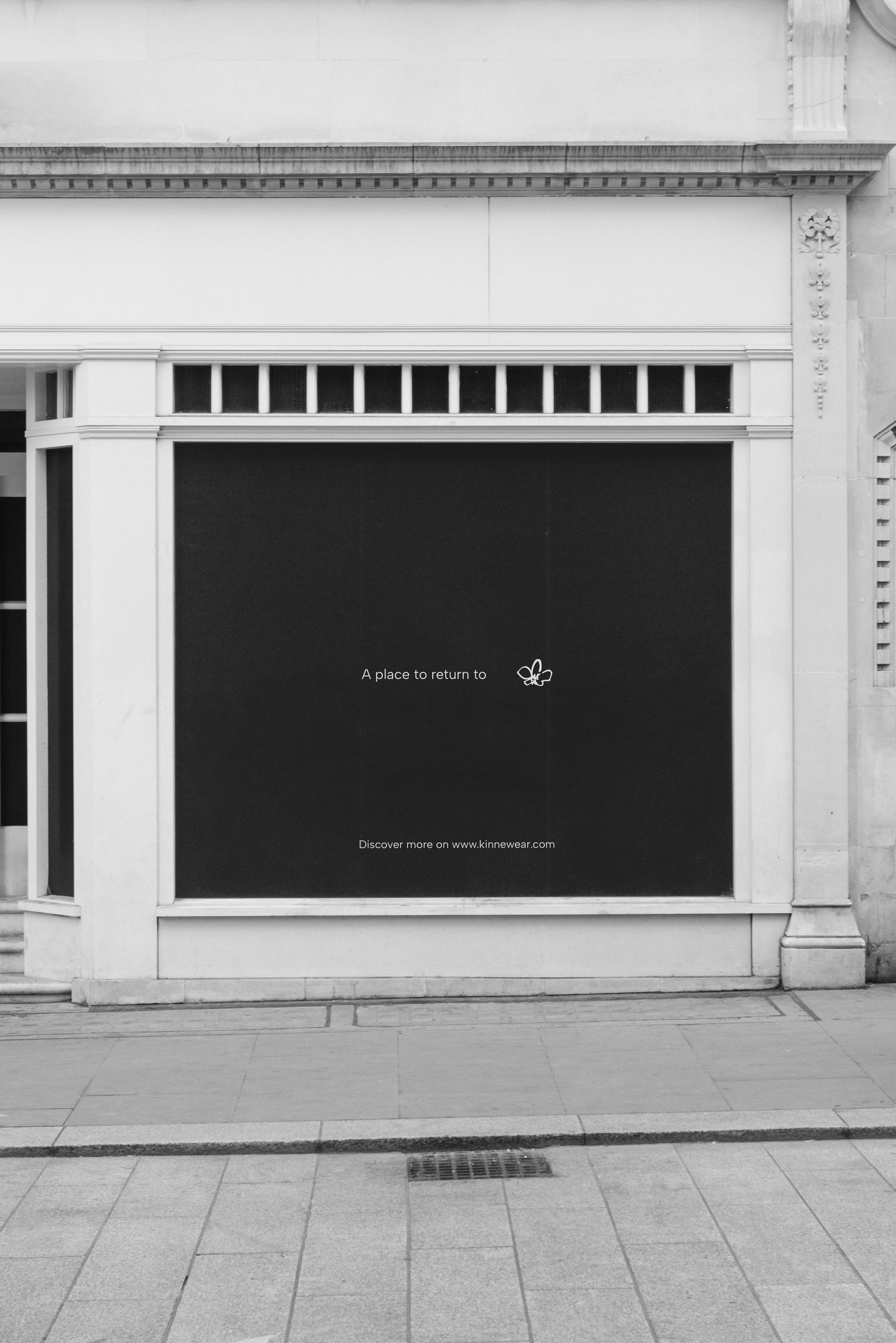
The brand identity design for Kinne was designed to reflect a slower and more intentional approach to dressing, creating a visual world that feels calm, timeless and natural lived in.
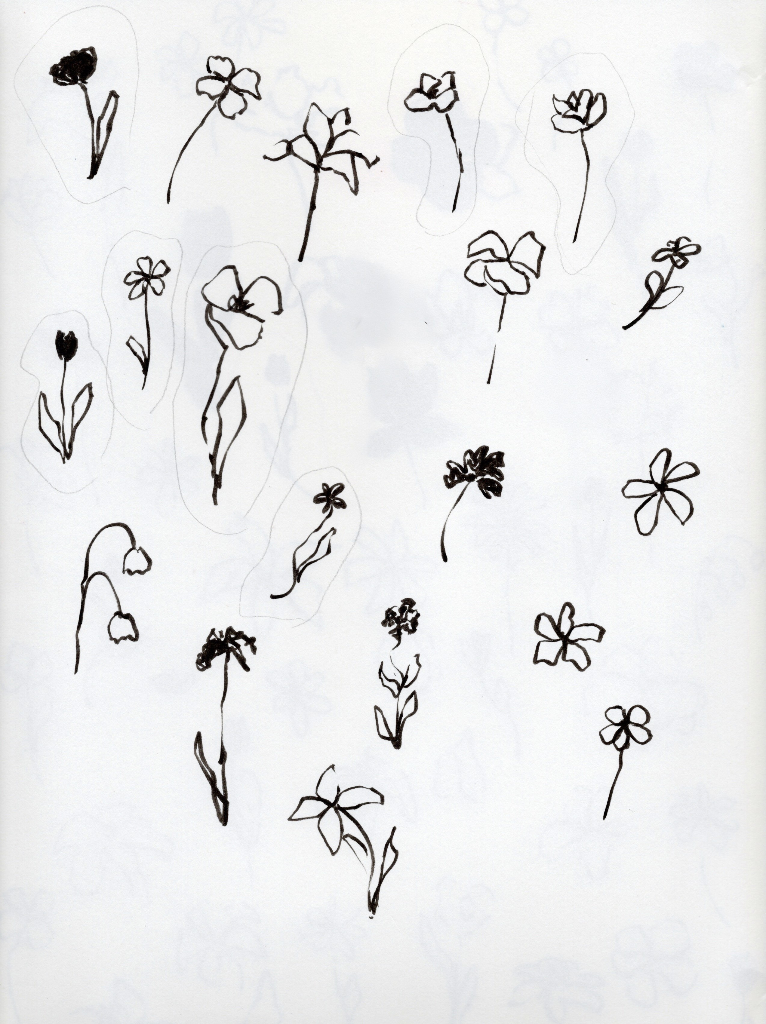
The visual direction was inspired by softness, familiarity, organic textures and effortless silhouettes.
The identity was shaped to evoke a sense of ease while mainting an elevated and contemporary feel.
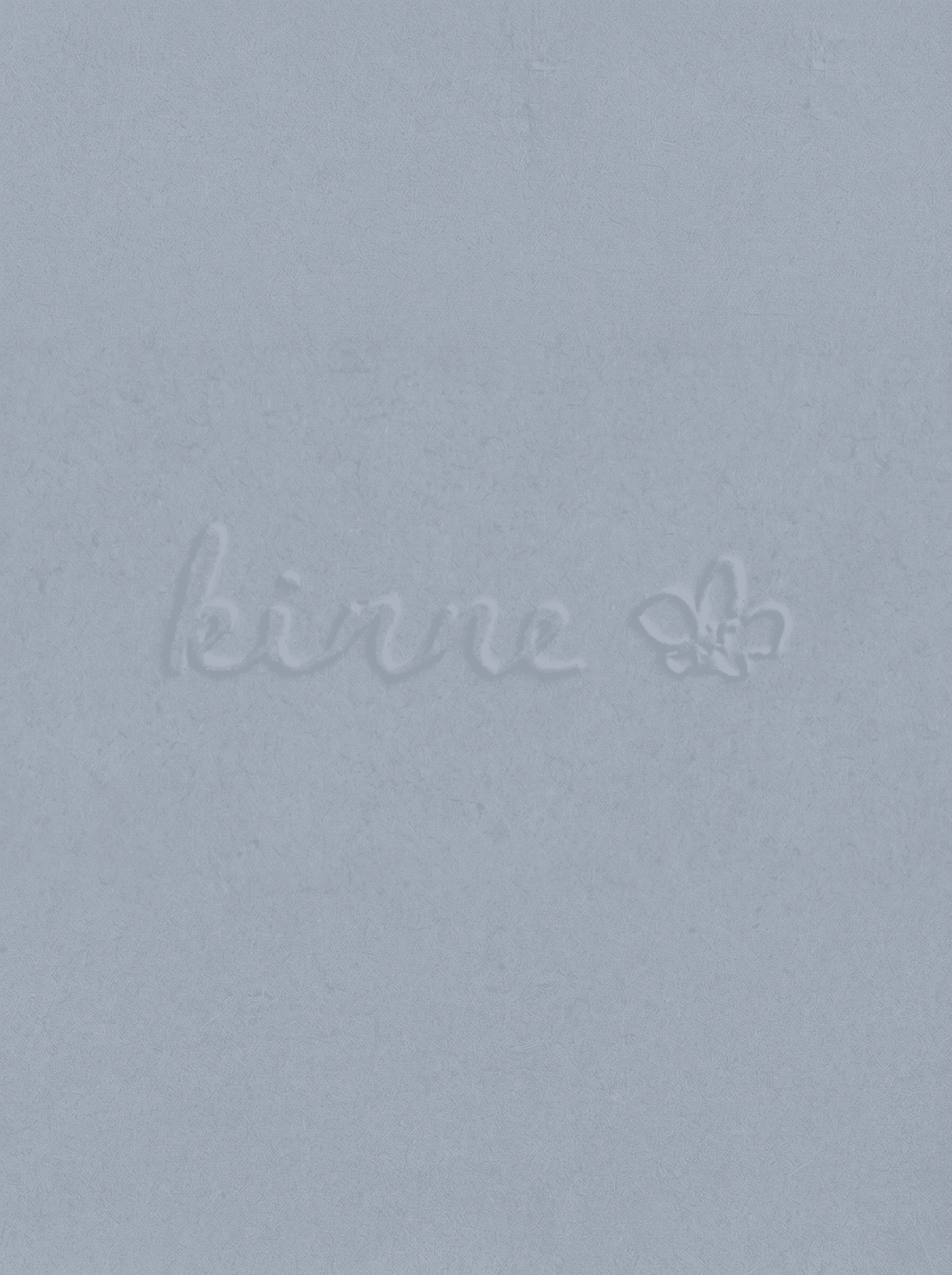
A handwritten logo suite and organic symbol system were developed to communicate warmth, authenticity and intimacy.
The fluid and imperfect forms bring a human quality to the brand.

The pieces from the brand are both effortless and timeless, and the logo suite reflects both of those qualities while being versatile to be used across all digital and physical platforms.
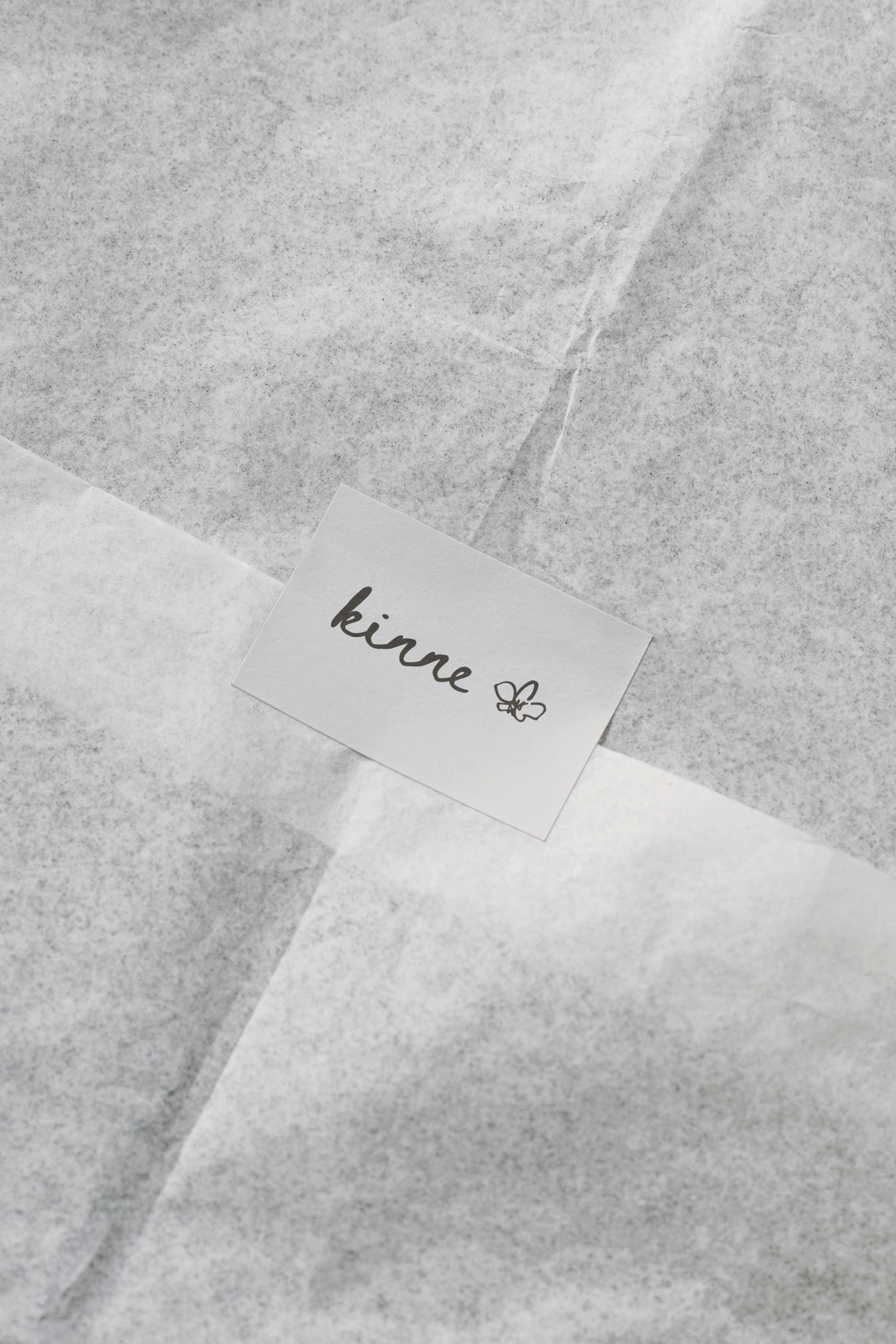
The typography and color palette were carefully selected to reinforce the brand´s positioning.
Neutral tones, muted blues, and earthy accents create a visual language tgat feels grounded, refined, and deeply connected to everyday rituals.
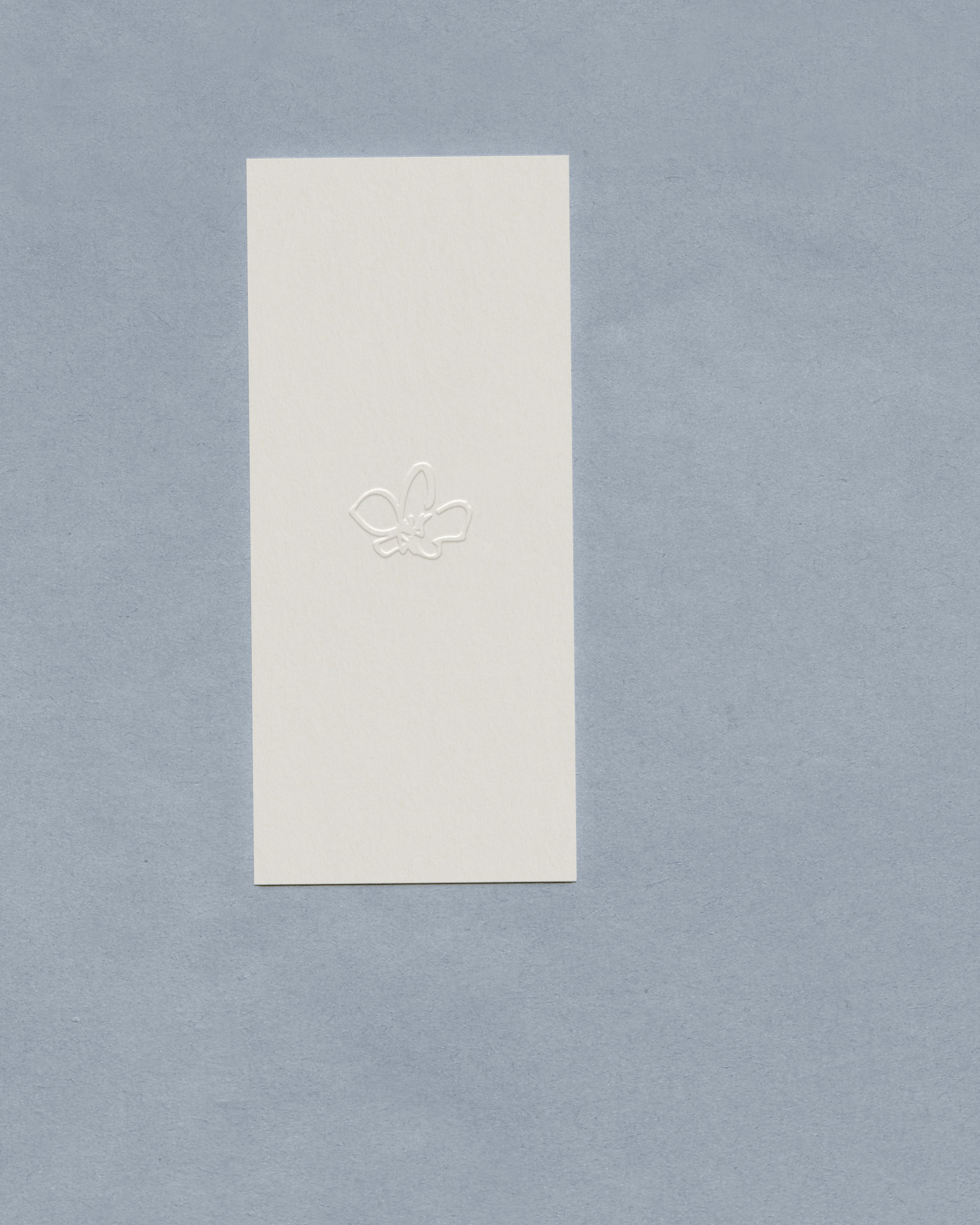
Icon design

The project included visual identity, logo design, typography, color palette, social media strategy, community concepts, packaging and stationery.
Everything designed to communicate a sense of simplicity, permanence and emotional connection.