
The visual identity for Fram was built around the idea of expertise stays close. As a boutique consultancy, it needed to feel highly professional and confident without becoming distant.
The name comes from the exploration ship built in the late 1800s and also means "forward" in Norwegian.

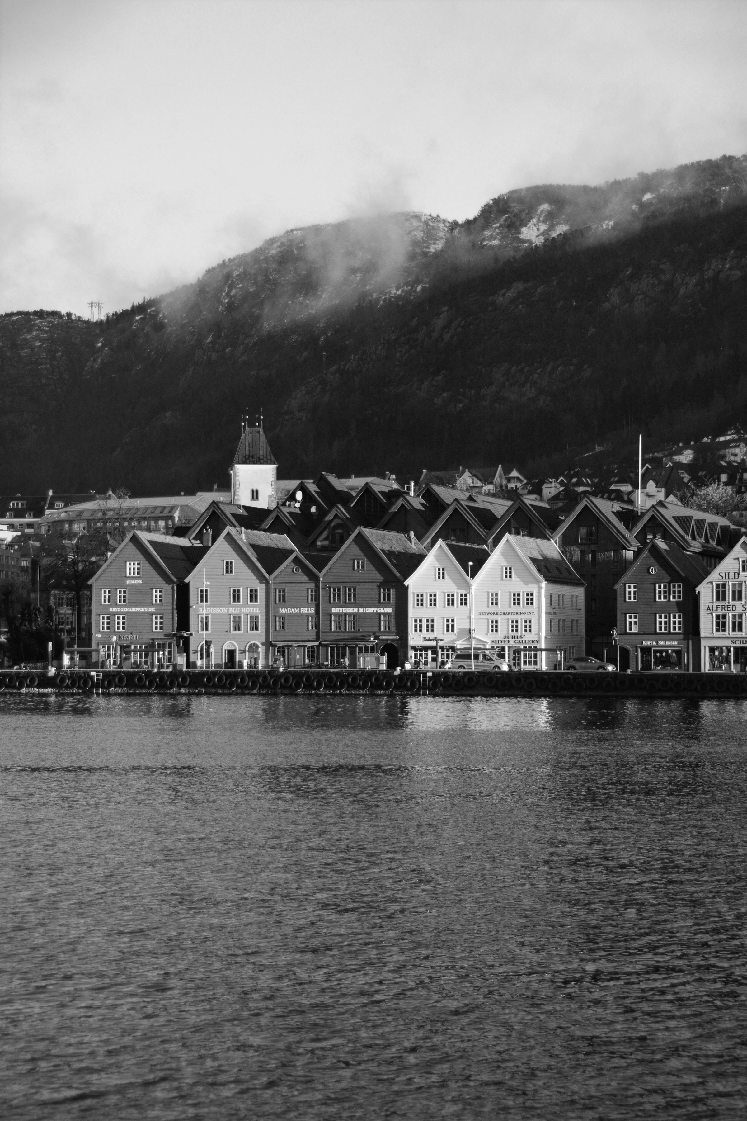
The identity combines a precise visual language with references to the culture and a moving forward mindset.
The result is a brand that feels ambitious, personal and forward thinking, reflecting Fram´s approach to helping businesses create clarity.

The main logo is intentionally simple and direct, using uppercase lettering to create a sense of authority and confident.
The distinctive triangular A is the key detail: its shape is inspired by one of the sails of the exploration ship Fram, connecting the identity to its heritage.
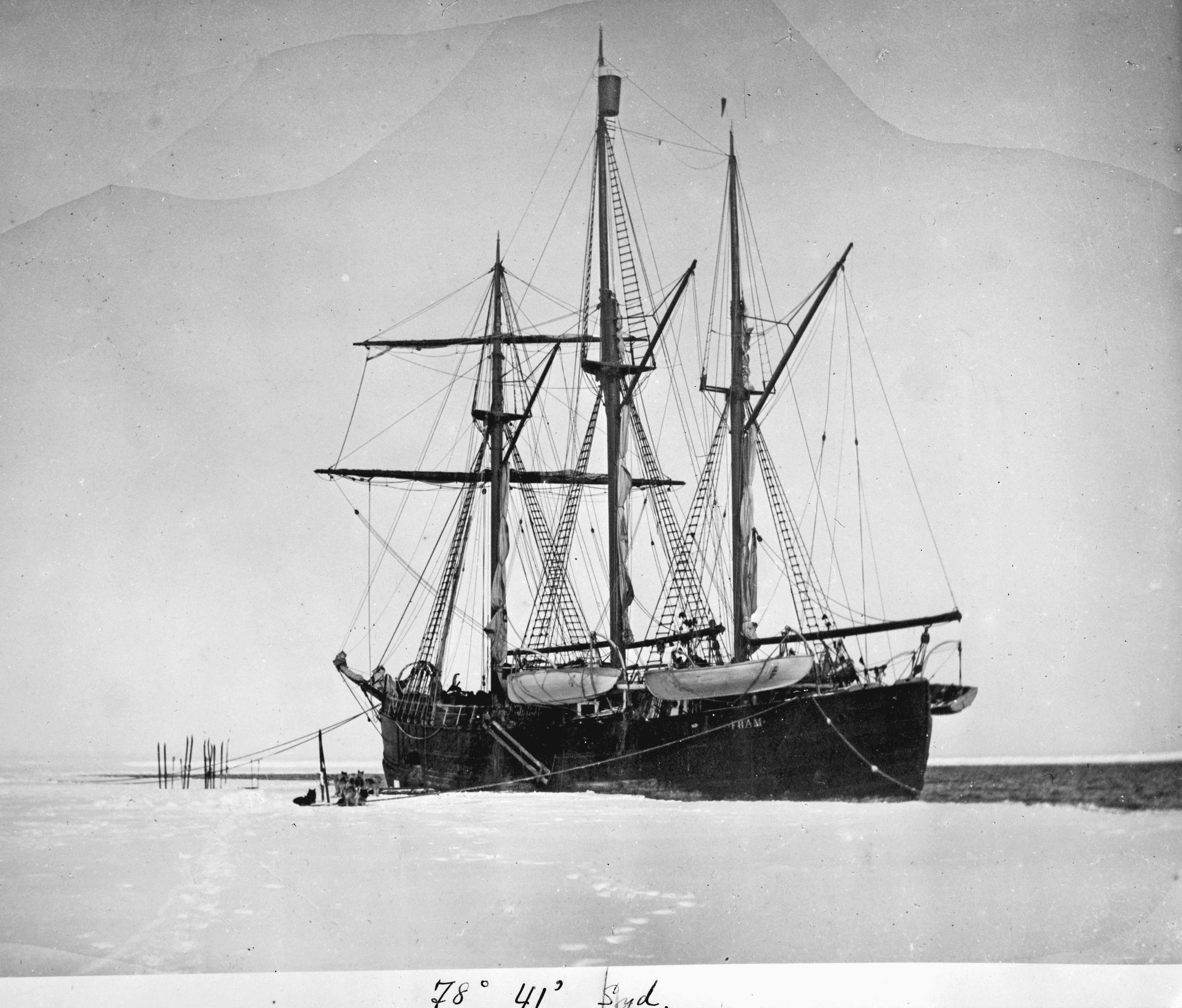
The icon distills the identity into a compact symbol made from three sail-inspired shapes, referencing the three sails of the Fram ship.

The form create a subtle sense of movement, direction and progress, reinforcing the consultancy´s role in helping business move forward.

Business card design.

The project also involved website design, which brings the identity into a digital enviroment.
It communicates the expertise through minimal typography, strong spacing, and the brand´s selected colour palette, centered around a deep blue.
Learn more about Fram here.